Breakthroughs and Innovations in Product Compromise: How to Face the "Propositional Essay"
产品妥协下的突破与创新:如何面对“命题作文”
Dec 10 · 2020
Designers, by nature, are service-oriented roles whose core responsibility is to solve problems in a creative way. Designers often aspire to excellence and excellence in their work, and are eager to make products that have a profound impact or even "change the world". However, in reality, especially in the business environment, designers often need to complete design tasks based on the needs, goals and constraints of the company, project or client. This situation is similar to facing an essay with a defined topic, where the designer needs to find a solution within the existing framework and provide the final design result.
设计师,本质属于服务型的角色,其核心职责是通过创造性的方式解决问题。设计师群体通常怀有向往卓越,打造极致的追求,渴望做出影响深远甚至“改变世界”的产品。然而现实情况中,尤其是商业环境下,设计师常常需要根据企业、项目或客户,提出的需求、目标和限制来完成设计任务,这种情况类似于面对一篇题目已经确定的作文,设计师需要在现有的框架内找到解决方案,并提供最终的设计成果。

Although the situation faced by designers seems to have great limitations, in the process of product construction, it is still necessary to continue to explore the space that can be utilized, and through innovative ways, to come up with a solution that meets both the quality of the design and the target needs. The Li ONE is a typical proposition. First of all, the interior design and screen specifications have already been determined, and its innovative "triple screen" is set in a relatively forward position, which leads to the limitation of the effective touch area of the screen, and at the same time, due to the steering wheel's blockage of the core area of the center screen, it is even more difficult to operate and obtain information. In the face of this situation, how to solve the current problem and improve the product experience is a very challenging task.
尽管设计师面对的处境似乎存在很大的局限性,但在产品的构建过程中,仍然需要不断挖掘可发挥的空间,通过创新的方式,提出既符合设计品质又满足目标需求的解决方案。理想 ONE 就是一个典型的命题作文。首先是内饰设计与屏幕规格已然确定,而其创新性的“三联屏”设置在相对靠前的位置,导致屏幕有效触控区域受限,同时由于方向盘对中控屏幕核心区域的遮挡,更是增加了操作与信息获取的难度。面对这一局面,如何解决当前问题并提升产品体验,是一项极具挑战性的任务。
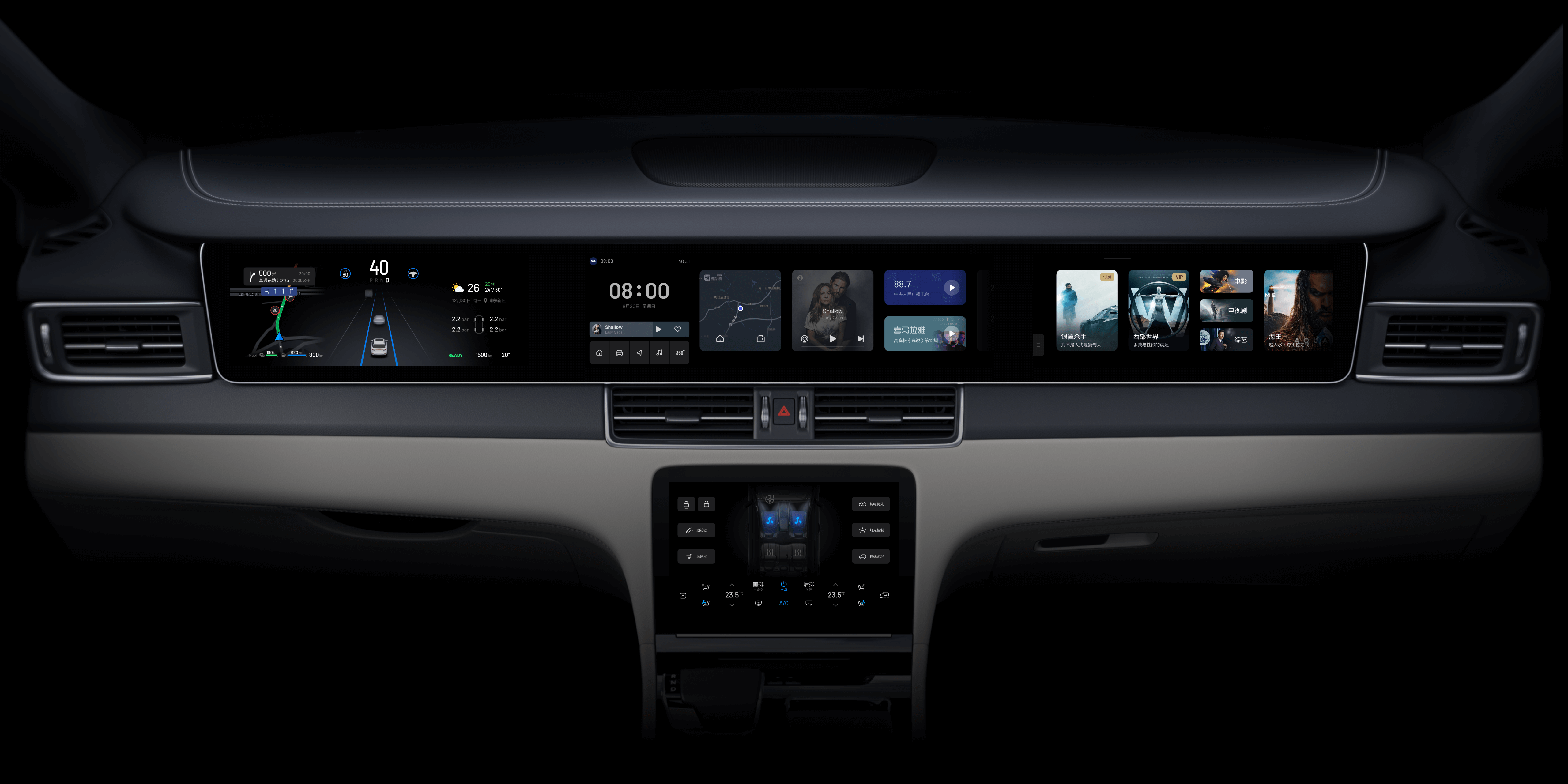
The left side of the Li ONE's center screen, which is the most comfortable operating area for the driver, was not fully utilized in the initial proposal, which included only three buttons and voice interaction. In subsequent iterations, it was planned to add app shortcuts in this area to make it easier for drivers to launch apps quickly. However, during the implementation process, we received a clear request from the CEO to use multiple buttons in an L-shaped arrangement. However, this layout was complex and cluttered from an experience perspective, but due to its high priority, the final design was completed and launched on the same day.
理想 ONE 中控屏的左侧,对驾驶员来说是最舒适的操作区域,最初的方案中并没有将此区域充分利用,仅包括三个按钮和语音交互功能。后续迭代中,计划在此区域增加应用快捷入口,以方便驾驶员能够快速启动应用。但在执行过程中,收到了来自 CEO 的明确需求:采用 L 型排布的多个按钮。然而,这种布局在体验角度上来说,复杂且凌乱,但由于其极高的优先级,最终的设计方案在当天即完成并上线。

Although this new solution was difficult to accept from a design point of view, with its chaotic order and poor perception, it was widely praised by users after it went live, who felt that the addition of app shortcuts in this area greatly improved the efficiency of operations during driving. From this result, it is clear that sometimes there are limitations from a design perspective alone. behind the CEO's demand, it is based on the experience gained from a long time of driving practice. From the design point of view, the rationality of the experience and the aesthetics of the presentation are more important.
尽管从设计角度看,这个新方案难以接受,它秩序混乱,观感欠佳,但上线后却受到了用户的广泛好评,用户们认为在该区域增加应用快捷入口,极大的提高了行车过程中的操作效率。从这个结果来看,有时仅从设计角度出发可能会存在较大的局限性。CEO 提出这样需求的背后,是基于长时间驾驶实践所得出的经验。而在设计角度,更看重是体验的合理性和呈现的美观度。
In subsequent iterations, the solution is continuously optimized on the basis of the initial version to further enhance the user experience. By enlarging the touchable area, the clicking sensation has been improved again and the safety of driving operation has been enhanced. In this version, the button size has been enlarged to the limit, and although the aesthetics are still poor, the previous problem of chaotic order has been better solved by adopting a more regular layout and a visually weaker button area. In an iteration six months later, the buttons were adjusted to the top 5 most used buttons and arranged horizontally underneath this area through a survey of user usage frequency data. So far, this solution has improved the design quality and product experience while taking into account the needs, but it is still a compromise based on the impact of hardware.
在后续的迭代中,持续在初版的基础上进行方案优化,以进一步提升用户体验。通过增大可触控区域,再次提升了点击感受,提高了行车操作的安全性。这一版本中,按钮尺寸已经扩大到了极限,虽然美观度仍然欠佳,但通过采用更规整的布局和视觉效果更弱的按钮区域,较好地解决了之前秩序混乱的问题。半年后的迭代中,通过对用户使用频率数据的调查,将按钮调整为使用率最高的 5 个,并横向排列于此区域下方。至此,这个方案在兼顾需求的同时,在设计品质和产品体验上有了较大的提升,但仍然是基于硬件影响下的一个妥协方案。

There are countless similar cases, including the most common question: why does the Ideal ONE's system only have a dark color mode and not a lighter color scheme that's more recognizable in daytime environments. In reality this is a decision due to its screen specifications. The RISO ONE's implementation across the long screen is made up of three separate screens spliced together, and with each screen having a relatively wide bezel, the use of a light color mode would have reduced the overall quality of the cabin. As a result, the initial dark background was gradually iterated to a solid black background for a better screen visual experience.
类似的案例数不胜数,其中包括最常见的问题:为什么理想 ONE 的系统只有深色模式,而没有在白天环境下识别度更高的浅色方案。实际上这也是由于其屏幕规格所导致的决策。理想 ONE 贯穿长屏的实现,是由三块独立的屏幕拼接而成,而每块屏幕的边框相对较宽,采用浅色模式就会降低整体的驾舱品质。因此,从最初的深色背景逐渐迭代到了纯黑色背景,以实现更佳的屏幕视觉体验。

From these cases, we can see that even though product design faces relatively limited requirements, it is still possible to bring better solutions to products through practical experience, data mining and more innovative means. "Dancing in shackles" may be the fate of the designer's profession, but it also brings greater challenges and opportunities. It is also the design profession's continuous pursuit of excellence and excellence that drives the continuous innovation and change of products in various industries, profoundly affects more people's lives, and even drives the development of the world.
从这些案例可以看出,即使产品设计面临相对局限的要求,仍然可以通过实践经验、数据挖掘和更具创新的手段,为产品带来更好的解决方案。“带着镣铐跳舞”可能是设计师这个职业的宿命,但同时也带来了更大的挑战和机遇。也正是设计这个职业持续对卓越和极致的追求,推动着各行业产品的不断创新与变化,深刻影响更多人的生活,甚至驱动着世界的发展。
Breakthroughs and Innovations in Product Compromise: How to Face the "Propositional Essay"
产品妥协下的突破与创新:如何面对“命题作文”
Dec 10 · 2020
设计师,本质属于服务型的角色,其核心职责是通过创造性的方式解决问题。设计师群体通常怀有向往卓越,打造极致的追求,渴望做出影响深远甚至“改变世界”的产品。然而现实情况中,尤其是商业环境下,设计师常常需要根据企业、项目或客户,提出的需求、目标和限制来完成设计任务,这种情况类似于面对一篇题目已经确定的作文,设计师需要在现有的框架内找到解决方案,并提供最终的设计成果。
尽管设计师面对的处境似乎存在很大的局限性,但在产品的构建过程中,仍然需要不断挖掘可发挥的空间,通过创新的方式,提出既符合设计品质又满足目标需求的解决方案。理想 ONE 就是一个典型的命题作文。首先是内饰设计与屏幕规格已然确定,而其创新性的“三联屏”设置在相对靠前的位置,导致屏幕有效触控区域受限,同时由于方向盘对中控屏幕核心区域的遮挡,更是增加了操作与信息获取的难度。面对这一局面,如何解决当前问题并提升产品体验,是一项极具挑战性的任务。
理想 ONE 中控屏的左侧,对驾驶员来说是最舒适的操作区域,最初的方案中并没有将此区域充分利用,仅包括三个按钮和语音交互功能。后续迭代中,计划在此区域增加应用快捷入口,以方便驾驶员能够快速启动应用。但在执行过程中,收到了来自 CEO 的明确需求:采用 L 型排布的多个按钮。然而,这种布局在体验角度上来说,复杂且凌乱,但由于其极高的优先级,最终的设计方案在当天即完成并上线。
尽管从设计角度看,这个新方案难以接受,它秩序混乱,观感欠佳,但上线后却受到了用户的广泛好评,用户们认为在该区域增加应用快捷入口,极大的提高了行车过程中的操作效率。从这个结果来看,有时仅从设计角度出发可能会存在较大的局限性。CEO 提出这样需求的背后,是基于长时间驾驶实践所得出的经验。而在设计角度,更看重是体验的合理性和呈现的美观度。
在后续的迭代中,持续在初版的基础上进行方案优化,以进一步提升用户体验。通过增大可触控区域,再次提升了点击感受,提高了行车操作的安全性。这一版本中,按钮尺寸已经扩大到了极限,虽然美观度仍然欠佳,但通过采用更规整的布局和视觉效果更弱的按钮区域,较好地解决了之前秩序混乱的问题。半年后的迭代中,通过对用户使用频率数据的调查,将按钮调整为使用率最高的 5 个,并横向排列于此区域下方。至此,这个方案在兼顾需求的同时,在设计品质和产品体验上有了较大的提升,但仍然是基于硬件影响下的一个妥协方案。
类似的案例数不胜数,其中包括最常见的问题:为什么理想 ONE 的系统只有深色模式,而没有在白天环境下识别度更高的浅色方案。实际上这也是由于其屏幕规格所导致的决策。理想 ONE 贯穿长屏的实现,是由三块独立的屏幕拼接而成,而每块屏幕的边框相对较宽,采用浅色模式就会降低整体的驾舱品质。因此,从最初的深色背景逐渐迭代到了纯黑色背景,以实现更佳的屏幕视觉体验。
从这些案例可以看出,即使产品设计面临相对局限的要求,仍然可以通过实践经验、数据挖掘和更具创新的手段,为产品带来更好的解决方案。“带着镣铐跳舞”可能是设计师这个职业的宿命,但同时也带来了更大的挑战和机遇。也正是设计这个职业持续对卓越和极致的追求,推动着各行业产品的不断创新与变化,深刻影响更多人的生活,甚至驱动着世界的发展。
Breakthroughs and Innovations in Product Compromise: How to Face the "Propositional Essay"
产品妥协下的突破与创新:如何面对“命题作文”
Dec 10 · 2020
Designers, by nature, are service-oriented roles whose core responsibility is to solve problems in a creative way. Designers often aspire to excellence and excellence in their work, and are eager to make products that have a profound impact or even "change the world". However, in reality, especially in the business environment, designers often need to complete design tasks based on the needs, goals and constraints of the company, project or client. This situation is similar to facing an essay with a defined topic, where the designer needs to find a solution within the existing framework and provide the final design result.
设计师,本质属于服务型的角色,其核心职责是通过创造性的方式解决问题。设计师群体通常怀有向往卓越,打造极致的追求,渴望做出影响深远甚至“改变世界”的产品。然而现实情况中,尤其是商业环境下,设计师常常需要根据企业、项目或客户,提出的需求、目标和限制来完成设计任务,这种情况类似于面对一篇题目已经确定的作文,设计师需要在现有的框架内找到解决方案,并提供最终的设计成果。
Although the situation faced by designers seems to have great limitations, in the process of product construction, it is still necessary to continue to explore the space that can be utilized, and through innovative ways, to come up with a solution that meets both the quality of the design and the target needs. The Li ONE is a typical proposition. First of all, the interior design and screen specifications have already been determined, and its innovative "triple screen" is set in a relatively forward position, which leads to the limitation of the effective touch area of the screen, and at the same time, due to the steering wheel's blockage of the core area of the center screen, it is even more difficult to operate and obtain information. In the face of this situation, how to solve the current problem and improve the product experience is a very challenging task.
尽管设计师面对的处境似乎存在很大的局限性,但在产品的构建过程中,仍然需要不断挖掘可发挥的空间,通过创新的方式,提出既符合设计品质又满足目标需求的解决方案。理想 ONE 就是一个典型的命题作文。首先是内饰设计与屏幕规格已然确定,而其创新性的“三联屏”设置在相对靠前的位置,导致屏幕有效触控区域受限,同时由于方向盘对中控屏幕核心区域的遮挡,更是增加了操作与信息获取的难度。面对这一局面,如何解决当前问题并提升产品体验,是一项极具挑战性的任务。
The left side of the Li ONE's center screen, which is the most comfortable operating area for the driver, was not fully utilized in the initial proposal, which included only three buttons and voice interaction. In subsequent iterations, it was planned to add app shortcuts in this area to make it easier for drivers to launch apps quickly. However, during the implementation process, we received a clear request from the CEO to use multiple buttons in an L-shaped arrangement. However, this layout was complex and cluttered from an experience perspective, but due to its high priority, the final design was completed and launched on the same day.
理想 ONE 中控屏的左侧,对驾驶员来说是最舒适的操作区域,最初的方案中并没有将此区域充分利用,仅包括三个按钮和语音交互功能。后续迭代中,计划在此区域增加应用快捷入口,以方便驾驶员能够快速启动应用。但在执行过程中,收到了来自 CEO 的明确需求:采用 L 型排布的多个按钮。然而,这种布局在体验角度上来说,复杂且凌乱,但由于其极高的优先级,最终的设计方案在当天即完成并上线。
Although this new solution was difficult to accept from a design point of view, with its chaotic order and poor perception, it was widely praised by users after it went live, who felt that the addition of app shortcuts in this area greatly improved the efficiency of operations during driving. From this result, it is clear that sometimes there are limitations from a design perspective alone. behind the CEO's demand, it is based on the experience gained from a long time of driving practice. From the design point of view, the rationality of the experience and the aesthetics of the presentation are more important.
尽管从设计角度看,这个新方案难以接受,它秩序混乱,观感欠佳,但上线后却受到了用户的广泛好评,用户们认为在该区域增加应用快捷入口,极大的提高了行车过程中的操作效率。从这个结果来看,有时仅从设计角度出发可能会存在较大的局限性。CEO 提出这样需求的背后,是基于长时间驾驶实践所得出的经验。而在设计角度,更看重是体验的合理性和呈现的美观度。
In subsequent iterations, the solution is continuously optimized on the basis of the initial version to further enhance the user experience. By enlarging the touchable area, the clicking sensation has been improved again and the safety of driving operation has been enhanced. In this version, the button size has been enlarged to the limit, and although the aesthetics are still poor, the previous problem of chaotic order has been better solved by adopting a more regular layout and a visually weaker button area. In an iteration six months later, the buttons were adjusted to the top 5 most used buttons and arranged horizontally underneath this area through a survey of user usage frequency data. So far, this solution has improved the design quality and product experience while taking into account the needs, but it is still a compromise based on the impact of hardware.
在后续的迭代中,持续在初版的基础上进行方案优化,以进一步提升用户体验。通过增大可触控区域,再次提升了点击感受,提高了行车操作的安全性。这一版本中,按钮尺寸已经扩大到了极限,虽然美观度仍然欠佳,但通过采用更规整的布局和视觉效果更弱的按钮区域,较好地解决了之前秩序混乱的问题。半年后的迭代中,通过对用户使用频率数据的调查,将按钮调整为使用率最高的 5 个,并横向排列于此区域下方。至此,这个方案在兼顾需求的同时,在设计品质和产品体验上有了较大的提升,但仍然是基于硬件影响下的一个妥协方案。
There are countless similar cases, including the most common question: why does the Ideal ONE's system only have a dark color mode and not a lighter color scheme that's more recognizable in daytime environments. In reality this is a decision due to its screen specifications. The RISO ONE's implementation across the long screen is made up of three separate screens spliced together, and with each screen having a relatively wide bezel, the use of a light color mode would have reduced the overall quality of the cabin. As a result, the initial dark background was gradually iterated to a solid black background for a better screen visual experience.
类似的案例数不胜数,其中包括最常见的问题:为什么理想 ONE 的系统只有深色模式,而没有在白天环境下识别度更高的浅色方案。实际上这也是由于其屏幕规格所导致的决策。理想 ONE 贯穿长屏的实现,是由三块独立的屏幕拼接而成,而每块屏幕的边框相对较宽,采用浅色模式就会降低整体的驾舱品质。因此,从最初的深色背景逐渐迭代到了纯黑色背景,以实现更佳的屏幕视觉体验。