The Impact of the Road Environment on Visual Design: The Relationship between Light and Color
道路环境对视觉设计的影响:光线与色彩的关系
Apr 26 · 2020
When a vehicle is in motion, the external light varies greatly due to the constant changes in time, weather and location. Changing light includes direct, side and backlighting from sunlight on a sunny day, street and tunnel lights at night, and even near-unlit dim environments, all of which create different light conditions inside the cabin. These variations in light require design elements that accurately communicate and adapt to the situation at all times.
在车辆行驶过程中,由于时间、天气和地点等因素的持续变化,外部的光线也随之千变万化。变化的光线包括晴天阳光的直射、侧射和逆光;夜晚路灯和隧道灯光的照射,甚至是接近无灯光的昏暗环境,这些不同的环境都会给驾舱内带来不同的光线情况。这一系列的光线变化就要求设计元素能够在任何时候下都能准确传达并适应当前情况。

In the field of smartphones, the ability of screen brightness to adapt itself according to the environment has been done very maturely. Through hardware such as light sensors, it is possible to realize automatic adjustment of screen brightness according to ambient light. In addition. The use of dark and light color modes in the UI can better adapt to different bright and dark environments. Among them, the iPhone's "original color display" function can also keep the color display of the phone screen consistent in different warm and cold light environments. These mature hardware and software solutions have been widely used in cockpit design. However, with the same hardware configuration and software strategy, the color aspect of cockpit UI design is still an issue that needs to be re-examined and rethought.
在智能手机领域,屏幕亮度根据环境自适应的能力已经做的非常成熟。通过光线传感器等硬件,可以实现根据环境光进行屏幕亮度自动调节。此外。在 UI 方面使用深色和浅色模式,可以更好地适应不同的亮暗环境。其中,iPhone 的「原彩显示」功能还可以在不同的冷暖光环境下保持手机屏幕的色彩显示一致。这些成熟的软硬件解决方案已经被广泛应用于驾舱设计中。然而,在具备相同硬件配置与软件策略的情况下,驾舱 UI 设计中的色彩方面仍是一个需要重新审视和思考的问题。

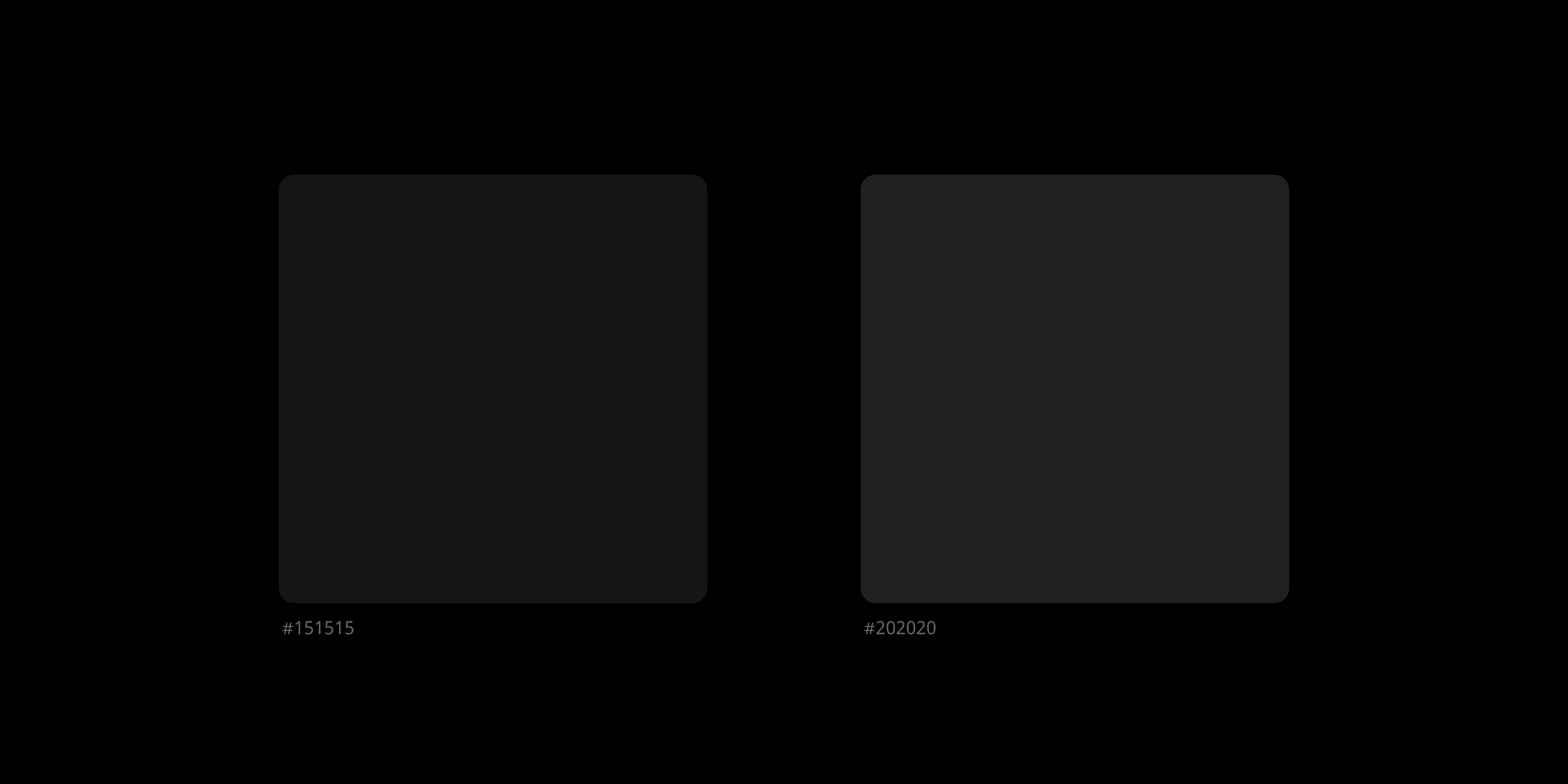
As all functions in the cockpit are designed to prioritize safety. Therefore, the color scheme of the UI design must be clear and recognizable under all circumstances to effectively and efficiently convey information, as well as aesthetically pleasing. Therefore, there are significant differences in the construction of the color system with other smart devices. For example, in the same design of dark color mode, the UI of cell phone can be used as a clickable button with a neutral color such as #151515 on a pure black (#000000) background, while in the car, the same color value can not be accurately identified even at the highest brightness under bright light, so the neutral color value may need to be increased to the area such as #202020 to ensure sufficient contrast. Contrast.
由于驾舱内的所有功能设计都优先服务于安全。因此,UI 设计的色彩方案必须在任何情况下都能确保清晰度和识别度,以有效且高效地传递信息,同时还要兼具美观感受。所以在色彩体系构建时与其他智能设备会存显著差异。例如,同样在深色模式的设计中,手机端 UI 在纯黑(#000000)的背景上,中性色使用如 #151515,就可以作为一个可点击的按钮,而在车载端,同样的色值,在强光下最高亮度也无法被准确识别,因此,中性色值可能就需要提高到如 #202020 这个区域,以确保足够的对比度。
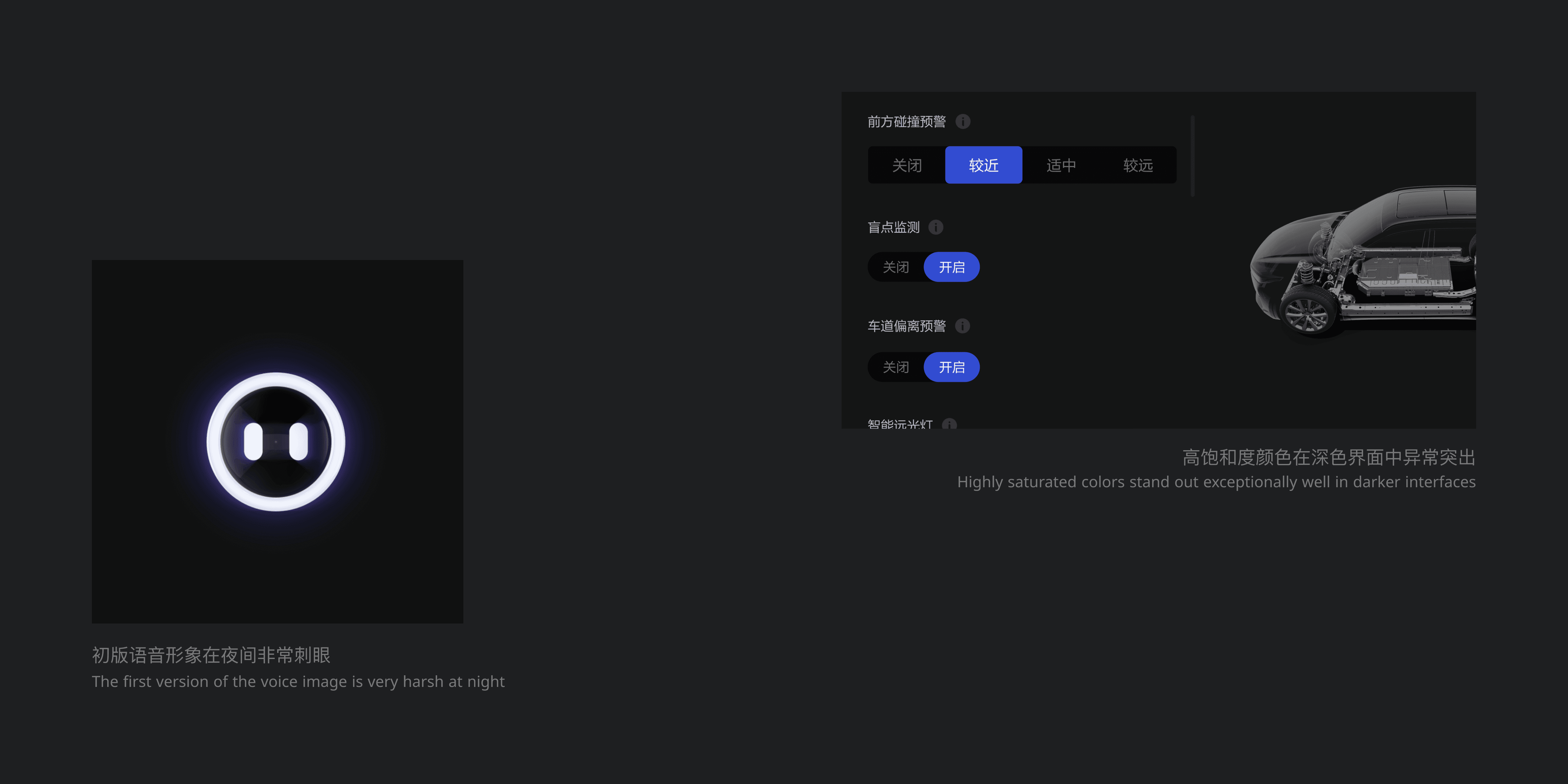
In terms of color, the design goal was to highlight important information elements while being quiet and non-intrusive. Highly saturated, large-area colors can stand out too much in a dark interface and interfere with the user's driving behavior. Even in a dark light environment, large bright colors may bring a feeling of turning on lights in the screen. In addition, in the regular color selection, should try to avoid the use of red and other colors with a warning meaning, because its appearance may bring panic and misjudgment to the user who is driving.
在彩色方面,设计目标是在突出重要信息元素同时,做到安静不打扰。高饱和度的大面积颜色,会在深色界面中显的过于突出,对用户的驾驶行为造成干扰。甚至在暗光环境下,大面积的亮色可能会带来一种屏幕中开启灯光的感受。此外,在常规色彩选用时,应尽量避免使用红色等具有警告含义的颜色,因为它的出现可能户给正在驾驶的用户带来恐慌与误判。
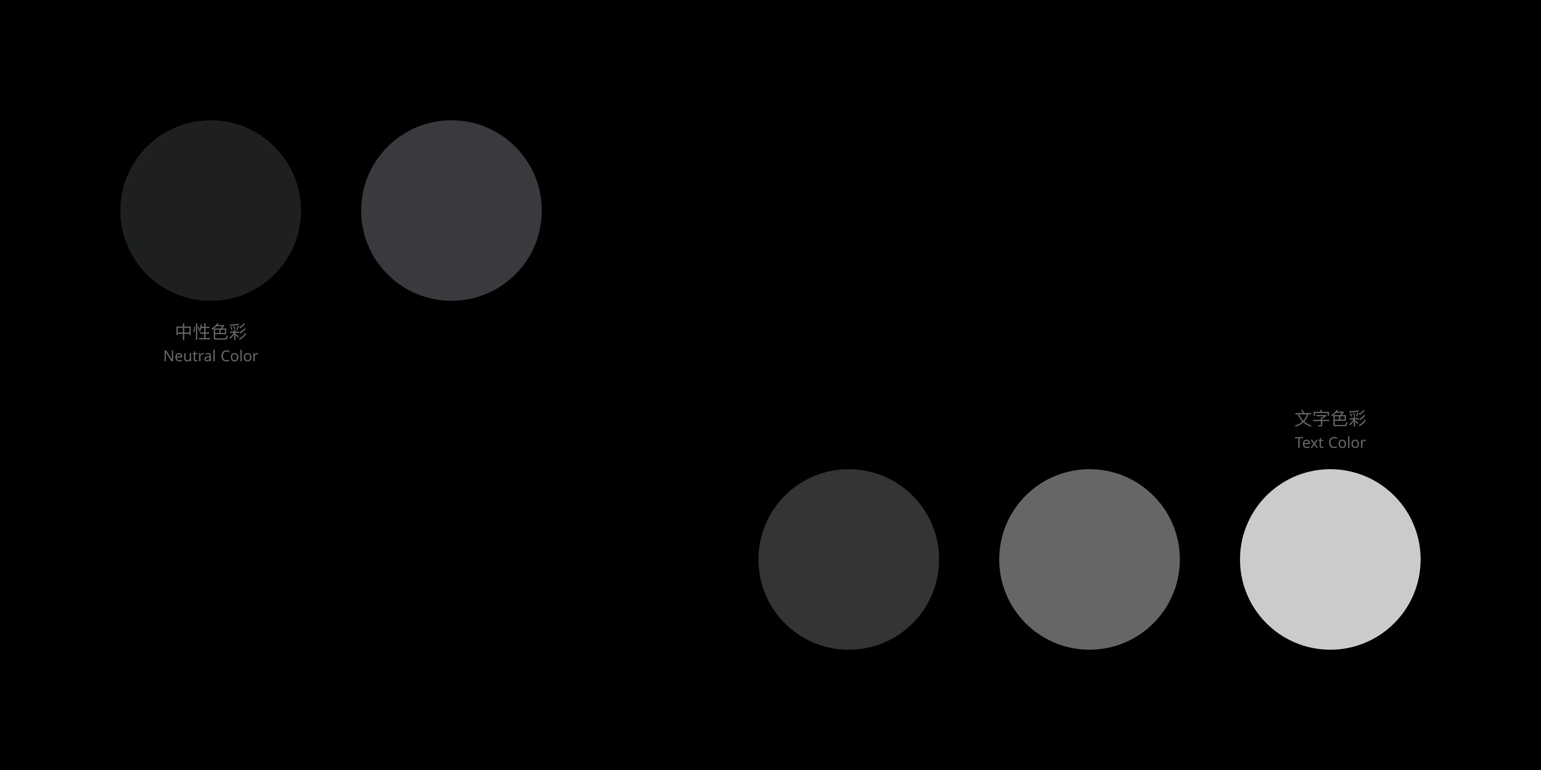
In the process of exploring the color scheme of LiOS, through repeated tests and adjustments in the light lab, a perfect color design system was finally formed, covering the background color, control color, text color and core primary color in the system. In the UI framework, two neutral colors are used to build the main and secondary framework of the whole system on a pure black page. Both neutrals have a blue tint to give them more texture. In the text section, based on pure white (#FFFFFF), three transparency levels are used: 20%, 40% and 80% to cover all text usage scenarios, corresponding to disabled text, secondary text and primary text.
在 LiOS 的色彩方案探索过程中,通过在光线实验室进行反复测试与调整,最终形成了一套完善的色彩设计体系,涵盖系统内的背景色彩、控件色彩、文字色彩与核心主色。在 UI 框架部分,采用两个中性色,在纯黑的页面上构建了整个系统的主次框架。两个中性色都具备蓝色倾向,使其更具质感。文字部分,在纯白(#FFFFFF)的基础上,采用三段式透明度:20%、40% 和 80%,以覆盖全部文字使用场景,对应禁用文字、辅助文字和主要文字。
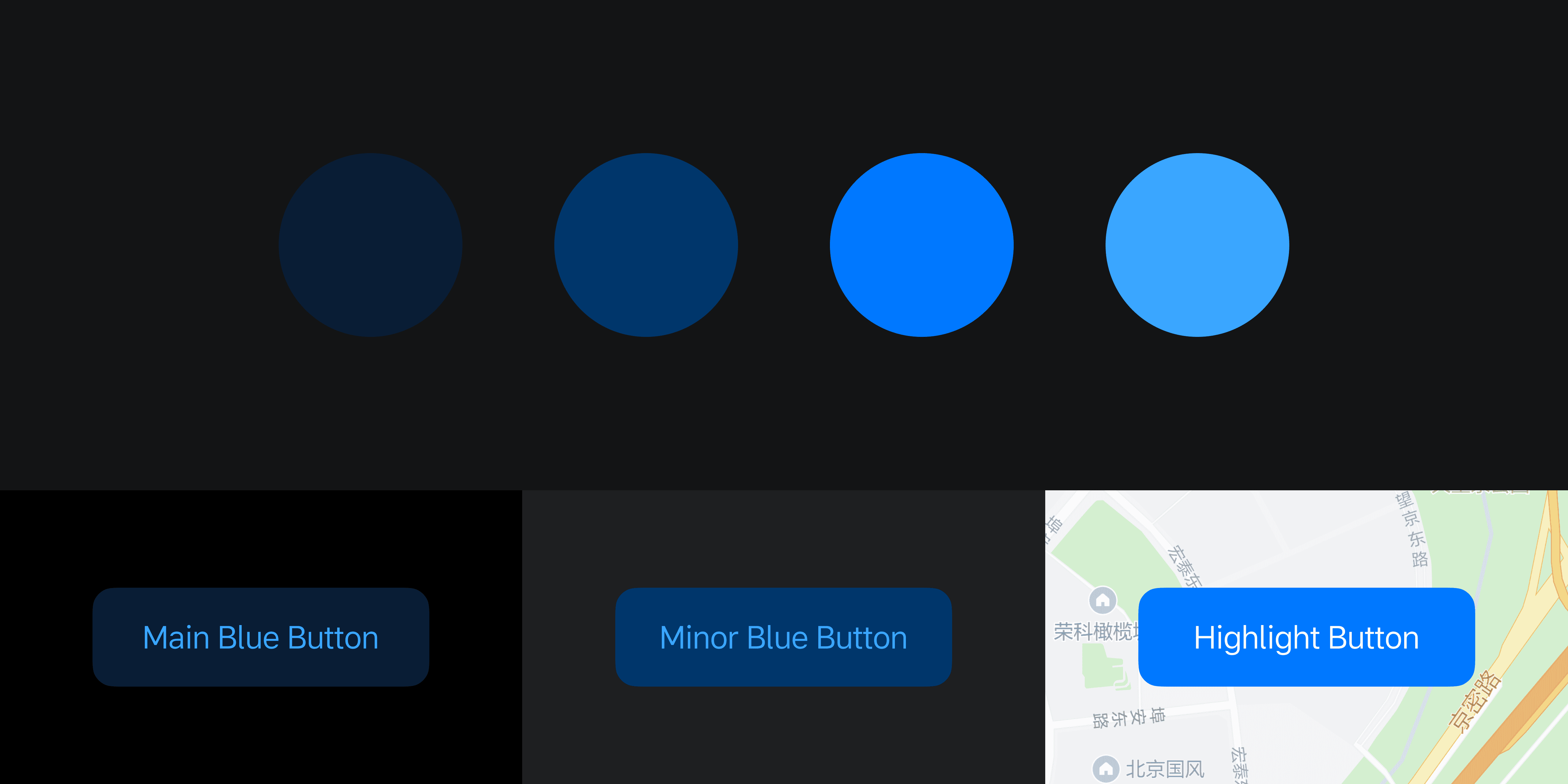
Due to the large size of the system and the variety of applications, four different blues were used to build the primary color system. Two of the primary blues were paired with two neutrals to ensure the same color effect on different backgrounds. In addition, on image-based (e.g. maps and pictures) backgrounds, a brighter blue is used to enhance the contrast of the elements. The brightest blue is used to highlight the text and is paired with the two main blues for the button design to neutralize the feeling of the low brightness of the two main blues, resulting in a quiet and non-intrusive experience for the buttons that is both recognizable and recognizable.
由于系统规模庞大,应用种类繁多,因此采用了 4 个不同的蓝色来构建主色体系。其中两个主要蓝色与两个中性色搭配,以确保在不同的背景上呈现相同的色彩效果。此外,在图像类(如地图和图片)背景上,则使用亮度更高的蓝色,以增强元素的对比度。最亮的蓝色用于高亮文字,并与两个主要蓝色搭配作为按钮设计,以中和两个主要蓝色低亮度的感受,使按钮形成安静不打扰,同时兼具良好识别性的体验。
Through the construction of the color system, it can ensure the recognition and readability of the whole system and each application, thus enhancing the experience of information transmission. At the same time, it also takes into account the aesthetic feeling, reflects the brand tone, and forms the brand's own style. In the use of color, there are also very clear rules and logic, so that the designers within the team can independently complete the application of the color system, and the error rate is extremely low, to ensure the efficiency of teamwork and the quality of design unity.
通过色彩体系的构建,能够确保整个系统以及每个应用的识别性与可读性,从而提升信息传递的体验。同时也兼顾了美观感受,体现出品牌调性,形成品牌自己的的风格。在色彩的使用方面,也有着非常清晰规则与逻辑,使团队内的设计师都能够独立完成色彩体系的应用,且错误率极低,保证了团队协作的效率与设计统一的品质。
The Impact of the Road Environment on Visual Design: The Relationship between Light and Color
道路环境对视觉设计的影响:光线与色彩的关系
Apr 26 · 2020
在车辆行驶过程中,由于时间、天气和地点等因素的持续变化,外部的光线也随之千变万化。变化的光线包括晴天阳光的直射、侧射和逆光;夜晚路灯和隧道灯光的照射,甚至是接近无灯光的昏暗环境,这些不同的环境都会给驾舱内带来不同的光线情况。这一系列的光线变化就要求设计元素能够在任何时候下都能准确传达并适应当前情况。
在智能手机领域,屏幕亮度根据环境自适应的能力已经做的非常成熟。通过光线传感器等硬件,可以实现根据环境光进行屏幕亮度自动调节。此外。在 UI 方面使用深色和浅色模式,可以更好地适应不同的亮暗环境。其中,iPhone 的「原彩显示」功能还可以在不同的冷暖光环境下保持手机屏幕的色彩显示一致。这些成熟的软硬件解决方案已经被广泛应用于驾舱设计中。然而,在具备相同硬件配置与软件策略的情况下,驾舱 UI 设计中的色彩方面仍是一个需要重新审视和思考的问题。
由于驾舱内的所有功能设计都优先服务于安全。因此,UI 设计的色彩方案必须在任何情况下都能确保清晰度和识别度,以有效且高效地传递信息,同时还要兼具美观感受。所以在色彩体系构建时与其他智能设备会存显著差异。例如,同样在深色模式的设计中,手机端 UI 在纯黑(#000000)的背景上,中性色使用如 #151515,就可以作为一个可点击的按钮,而在车载端,同样的色值,在强光下最高亮度也无法被准确识别,因此,中性色值可能就需要提高到如 #202020 这个区域,以确保足够的对比度。
在彩色方面,设计目标是在突出重要信息元素同时,做到安静不打扰。高饱和度的大面积颜色,会在深色界面中显的过于突出,对用户的驾驶行为造成干扰。甚至在暗光环境下,大面积的亮色可能会带来一种屏幕中开启灯光的感受。此外,在常规色彩选用时,应尽量避免使用红色等具有警告含义的颜色,因为它的出现可能户给正在驾驶的用户带来恐慌与误判。
在 LiOS 的色彩方案探索过程中,通过在光线实验室进行反复测试与调整,最终形成了一套完善的色彩设计体系,涵盖系统内的背景色彩、控件色彩、文字色彩与核心主色。在 UI 框架部分,采用两个中性色,在纯黑的页面上构建了整个系统的主次框架。两个中性色都具备蓝色倾向,使其更具质感。文字部分,在纯白(#FFFFFF)的基础上,采用三段式透明度:20%、40% 和 80%,以覆盖全部文字使用场景,对应禁用文字、辅助文字和主要文字。
由于系统规模庞大,应用种类繁多,因此采用了 4 个不同的蓝色来构建主色体系。其中两个主要蓝色与两个中性色搭配,以确保在不同的背景上呈现相同的色彩效果。此外,在图像类(如地图和图片)背景上,则使用亮度更高的蓝色,以增强元素的对比度。最亮的蓝色用于高亮文字,并与两个主要蓝色搭配作为按钮设计,以中和两个主要蓝色低亮度的感受,使按钮形成安静不打扰,同时兼具良好识别性的体验。
通过色彩体系的构建,能够确保整个系统以及每个应用的识别性与可读性,从而提升信息传递的体验。同时也兼顾了美观感受,体现出品牌调性,形成品牌自己的的风格。在色彩的使用方面,也有着非常清晰规则与逻辑,使团队内的设计师都能够独立完成色彩体系的应用,且错误率极低,保证了团队协作的效率与设计统一的品质。
The Impact of the Road Environment on Visual Design: The Relationship between Light and Color
道路环境对视觉设计的影响:光线与色彩的关系
Apr 26 · 2020
When a vehicle is in motion, the external light varies greatly due to the constant changes in time, weather and location. Changing light includes direct, side and backlighting from sunlight on a sunny day, street and tunnel lights at night, and even near-unlit dim environments, all of which create different light conditions inside the cabin. These variations in light require design elements that accurately communicate and adapt to the situation at all times.
在车辆行驶过程中,由于时间、天气和地点等因素的持续变化,外部的光线也随之千变万化。变化的光线包括晴天阳光的直射、侧射和逆光;夜晚路灯和隧道灯光的照射,甚至是接近无灯光的昏暗环境,这些不同的环境都会给驾舱内带来不同的光线情况。这一系列的光线变化就要求设计元素能够在任何时候下都能准确传达并适应当前情况。
In the field of smartphones, the ability of screen brightness to adapt itself according to the environment has been done very maturely. Through hardware such as light sensors, it is possible to realize automatic adjustment of screen brightness according to ambient light. In addition. The use of dark and light color modes in the UI can better adapt to different bright and dark environments. Among them, the iPhone's "original color display" function can also keep the color display of the phone screen consistent in different warm and cold light environments. These mature hardware and software solutions have been widely used in cockpit design. However, with the same hardware configuration and software strategy, the color aspect of cockpit UI design is still an issue that needs to be re-examined and rethought.
在智能手机领域,屏幕亮度根据环境自适应的能力已经做的非常成熟。通过光线传感器等硬件,可以实现根据环境光进行屏幕亮度自动调节。此外。在 UI 方面使用深色和浅色模式,可以更好地适应不同的亮暗环境。其中,iPhone 的「原彩显示」功能还可以在不同的冷暖光环境下保持手机屏幕的色彩显示一致。这些成熟的软硬件解决方案已经被广泛应用于驾舱设计中。然而,在具备相同硬件配置与软件策略的情况下,驾舱 UI 设计中的色彩方面仍是一个需要重新审视和思考的问题。
As all functions in the cockpit are designed to prioritize safety. Therefore, the color scheme of the UI design must be clear and recognizable under all circumstances to effectively and efficiently convey information, as well as aesthetically pleasing. Therefore, there are significant differences in the construction of the color system with other smart devices. For example, in the same design of dark color mode, the UI of cell phone can be used as a clickable button with a neutral color such as #151515 on a pure black (#000000) background, while in the car, the same color value can not be accurately identified even at the highest brightness under bright light, so the neutral color value may need to be increased to the area such as #202020 to ensure sufficient contrast. Contrast.
由于驾舱内的所有功能设计都优先服务于安全。因此,UI 设计的色彩方案必须在任何情况下都能确保清晰度和识别度,以有效且高效地传递信息,同时还要兼具美观感受。所以在色彩体系构建时与其他智能设备会存显著差异。例如,同样在深色模式的设计中,手机端 UI 在纯黑(#000000)的背景上,中性色使用如 #151515,就可以作为一个可点击的按钮,而在车载端,同样的色值,在强光下最高亮度也无法被准确识别,因此,中性色值可能就需要提高到如 #202020 这个区域,以确保足够的对比度。
In terms of color, the design goal was to highlight important information elements while being quiet and non-intrusive. Highly saturated, large-area colors can stand out too much in a dark interface and interfere with the user's driving behavior. Even in a dark light environment, large bright colors may bring a feeling of turning on lights in the screen. In addition, in the regular color selection, should try to avoid the use of red and other colors with a warning meaning, because its appearance may bring panic and misjudgment to the user who is driving.
在彩色方面,设计目标是在突出重要信息元素同时,做到安静不打扰。高饱和度的大面积颜色,会在深色界面中显的过于突出,对用户的驾驶行为造成干扰。甚至在暗光环境下,大面积的亮色可能会带来一种屏幕中开启灯光的感受。此外,在常规色彩选用时,应尽量避免使用红色等具有警告含义的颜色,因为它的出现可能户给正在驾驶的用户带来恐慌与误判。
In the process of exploring the color scheme of LiOS, through repeated tests and adjustments in the light lab, a perfect color design system was finally formed, covering the background color, control color, text color and core primary color in the system. In the UI framework, two neutral colors are used to build the main and secondary framework of the whole system on a pure black page. Both neutrals have a blue tint to give them more texture. In the text section, based on pure white (#FFFFFF), three transparency levels are used: 20%, 40% and 80% to cover all text usage scenarios, corresponding to disabled text, secondary text and primary text.
在 LiOS 的色彩方案探索过程中,通过在光线实验室进行反复测试与调整,最终形成了一套完善的色彩设计体系,涵盖系统内的背景色彩、控件色彩、文字色彩与核心主色。在 UI 框架部分,采用两个中性色,在纯黑的页面上构建了整个系统的主次框架。两个中性色都具备蓝色倾向,使其更具质感。文字部分,在纯白(#FFFFFF)的基础上,采用三段式透明度:20%、40% 和 80%,以覆盖全部文字使用场景,对应禁用文字、辅助文字和主要文字。
Due to the large size of the system and the variety of applications, four different blues were used to build the primary color system. Two of the primary blues were paired with two neutrals to ensure the same color effect on different backgrounds. In addition, on image-based (e.g. maps and pictures) backgrounds, a brighter blue is used to enhance the contrast of the elements. The brightest blue is used to highlight the text and is paired with the two main blues for the button design to neutralize the feeling of the low brightness of the two main blues, resulting in a quiet and non-intrusive experience for the buttons that is both recognizable and recognizable.
由于系统规模庞大,应用种类繁多,因此采用了 4 个不同的蓝色来构建主色体系。其中两个主要蓝色与两个中性色搭配,以确保在不同的背景上呈现相同的色彩效果。此外,在图像类(如地图和图片)背景上,则使用亮度更高的蓝色,以增强元素的对比度。最亮的蓝色用于高亮文字,并与两个主要蓝色搭配作为按钮设计,以中和两个主要蓝色低亮度的感受,使按钮形成安静不打扰,同时兼具良好识别性的体验。